How to make AI comics people actually want to read

A practical, step-by-step guide with examples. Build a character card, lock a look that stays the same in every panel, pick a style, script four panels, leave room for the words, and avoid the two failures everyone hits.
The hard part of an AI comic is no longer the drawing. It is the same things that were always hard: a character worth following, a look that stays the same, and a joke that lands in four panels. This guide walks through the whole process with one example character, made up just for this article, including what went wrong.
We make Mutuals Comics, a comic series that posts every day. Everything below is what we wish someone had told us on day one. It works with whichever image tool you already use.
Meet Wren. She is a bike courier in Lisbon, she is terrified of hills, and her corgi Biscuit rides in her bag. She did not exist an hour before this article was written. Every image here is her.
1. Write a character card before any image
The most common mistake is generating a beautiful picture and then trying to find a story in it. You end up with a gallery, not a comic. Start with a card instead: six short lines you can read in ten seconds.
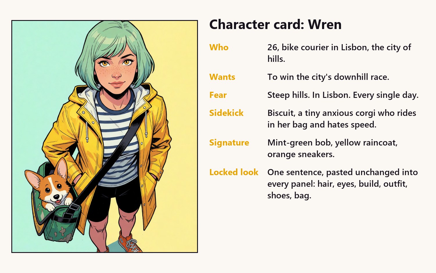
- Who: age, job, where they live. Specific beats impressive.
- Wants: one goal big enough to carry a season.
- Fear or secret: the thing in their way. Your best episodes come from it.
- Sidekick: a pet or friend who pushes back. Comedy needs someone to react.
- Signature: two or three visual features nobody can miss.
- Locked look: the exact description you will paste into every panel.
The sidekick matters more than you think. A character alone in a panel can only look happy or sad. Give her a corgi who refuses to get in the bag, and every panel has a second reaction to play with.
2. Lock the look and never improvise it
Readers forgive a lot, but not a main character who changes face between panels. The fix is boring and it works: write the look as one long sentence and paste it unchanged into every prompt. Same words, same order, every time.
A good locked look covers six things, in this order: age and role, hair, eyes and face, build, outfit, shoes and accessories. Wren's is: "a 26-year-old bike courier with a short mint-green bob, freckles, bright amber eyes and a wide gap-toothed grin, a slim athletic build, a bright yellow raincoat over a striped navy and white t-shirt, black cycling shorts, orange high-top sneakers and a battered green messenger bag."
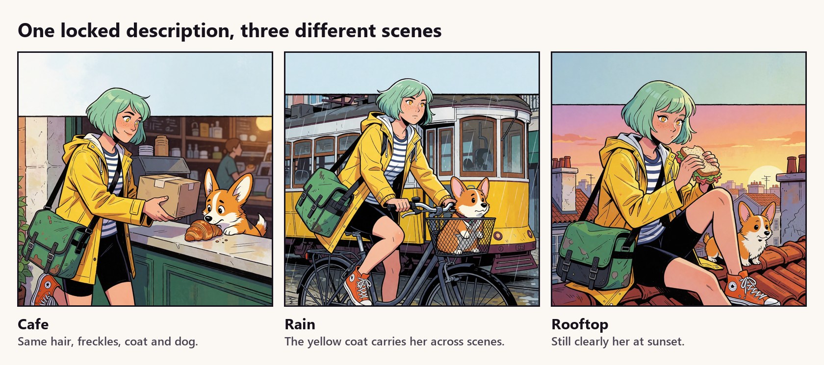
Then let the signature do the heavy lifting. When a stripe or a strap changes between panels, and it will, the mint-green bob and the yellow raincoat still say "that's her". If your tool supports a fixed seed or a reference image, use it too, but the description is the part you control.
3. Pick one style and commit to it
The same character works in very different styles, and the style changes how the joke reads. Try your character in two or three, pick one, and keep it for the whole series. Switching styles mid-story makes it look like a different comic.
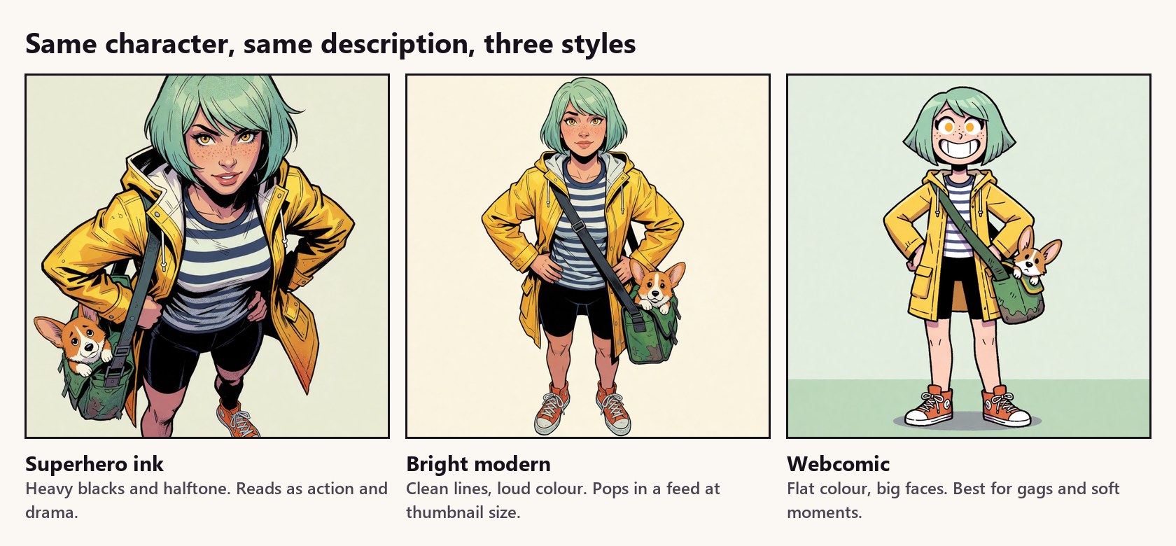
- Superhero ink: heavy blacks, halftone dots, dramatic shadows. Good for action and big emotional moments.
- Bright modern: crisp lines and very saturated colour. It survives being a tiny thumbnail in a feed, which is where most people will see it.
- Webcomic: flat colour and big expressive faces. The best choice for gags, cute moments and readers who scroll fast.
Put the style words first in the prompt and keep them identical across every panel, exactly like the locked look. A useful pattern is: style words, then "comic panel", then one sentence of action, then the locked look of whoever is in the shot.
4. Write the joke before you render anything
Four panels: setup, build, turn, payoff. Write all four as one sentence each before you generate a single image. If the joke doesn't work as four sentences, no amount of rendering will save it.
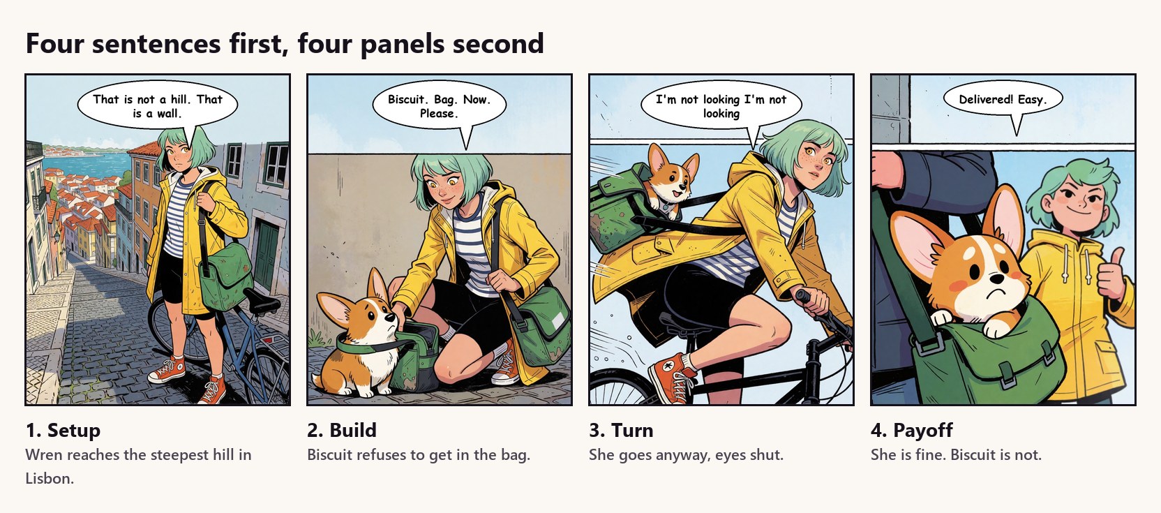
Notice where the joke lands: not on Wren, who survives the hill, but on Biscuit, who did not sign up for any of it. Giving the payoff to the sidekick is the cheapest way to make a strip funny.
5. The two failures you will hit, and the fix
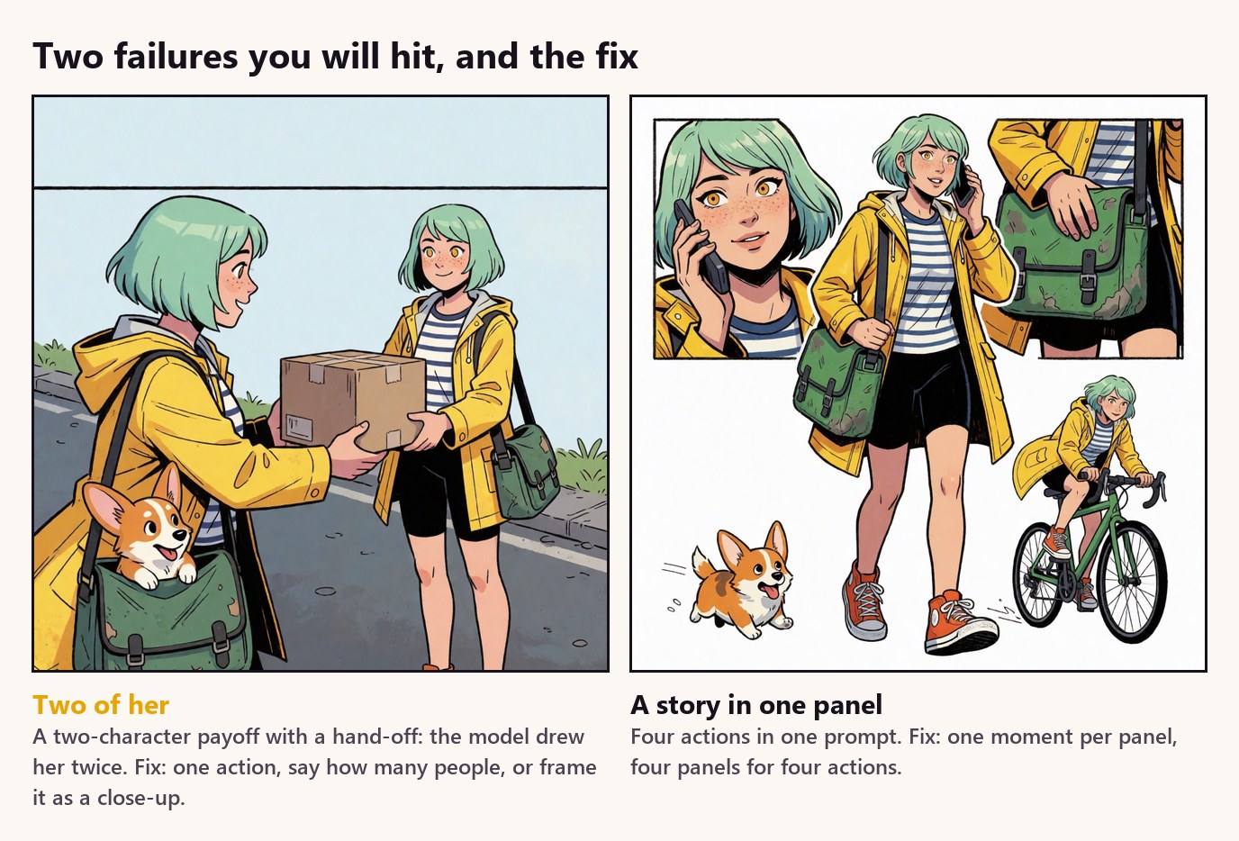
Two of her. Prompts where your character gives something to someone, or where a second person is described in detail, often come back with the main character drawn twice. Say outright how many people are in the panel, give each one a different look, or reframe the beat as a close-up on one of them, which is exactly how the payoff above ended up on Biscuit.
A story in one panel. Ask for "she gets a call, grabs her bag, runs downstairs and jumps on her bike" and the model tries to show all of it at once, by drawing a little comic page inside your image. One panel, one moment. If it needs four actions, it needs four panels.
Both are cheap to fix: re-roll with the shorter prompt rather than trying to repair the image.
6. Leave room for the words
Image models are still bad at lettering. Don't ask them for speech bubbles or signs. Ask for empty space instead, a plain sky or wall across the top fifth of the panel, and add the text yourself afterwards.
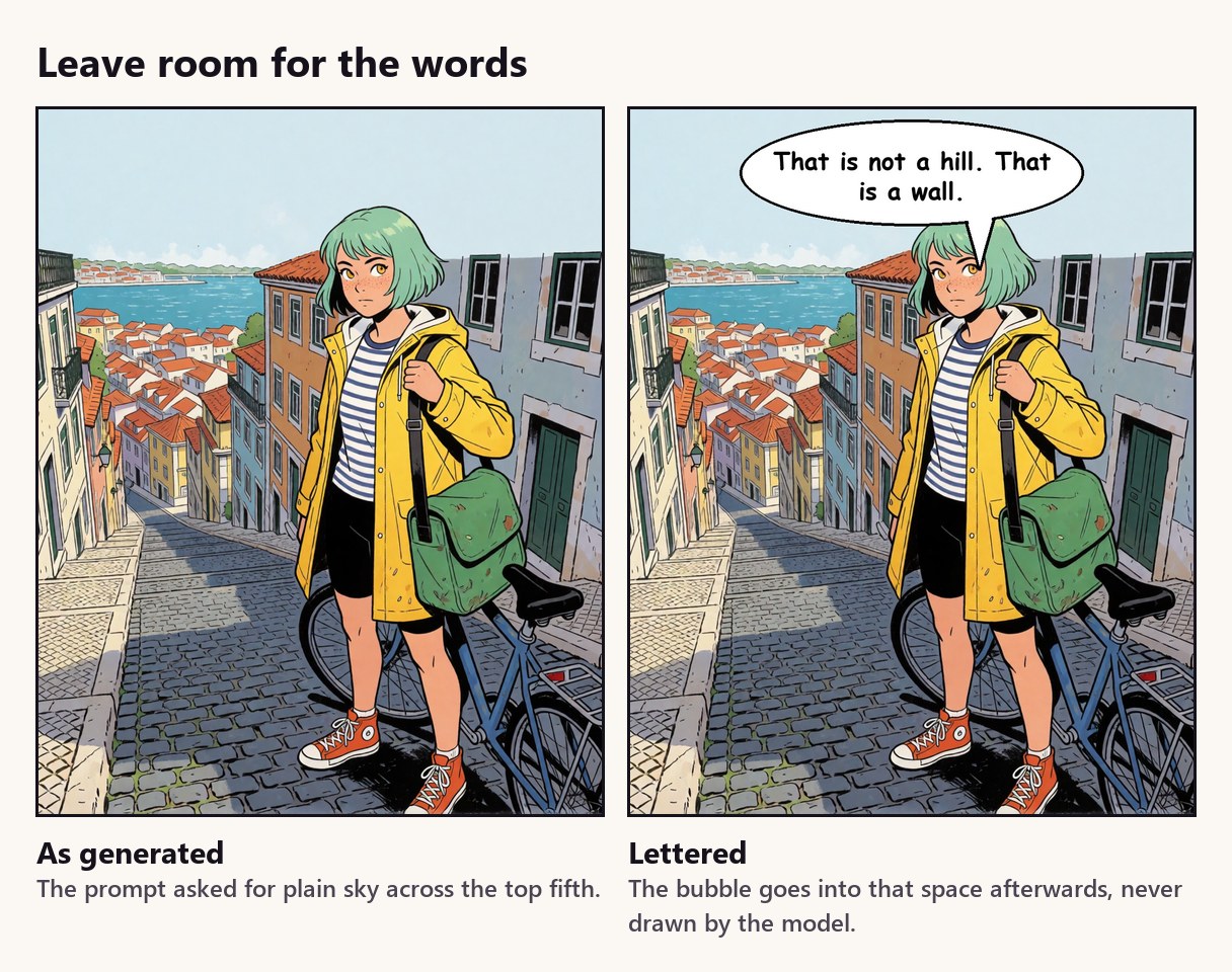
You get clean, readable bubbles, you can rewrite a line at midnight without touching the art, and you can translate the comic later by swapping text. Keep bubbles to ten words; if it needs more, it needs another panel.
7. Make it a series, then let readers in
A single funny strip gets a laugh. A series gets followers. Number your episodes, end on a small question, and let the next episode pick up where the last one stopped. Wren's season writes itself from her card: the hills, a rival courier, the city's downhill race in the finale.
The best-performing posts in our own series were not stories at all. They invited readers in: describe yourself and a character draws you, describe your style and a character designs you a look. Everyone who takes part has a reason to come back.
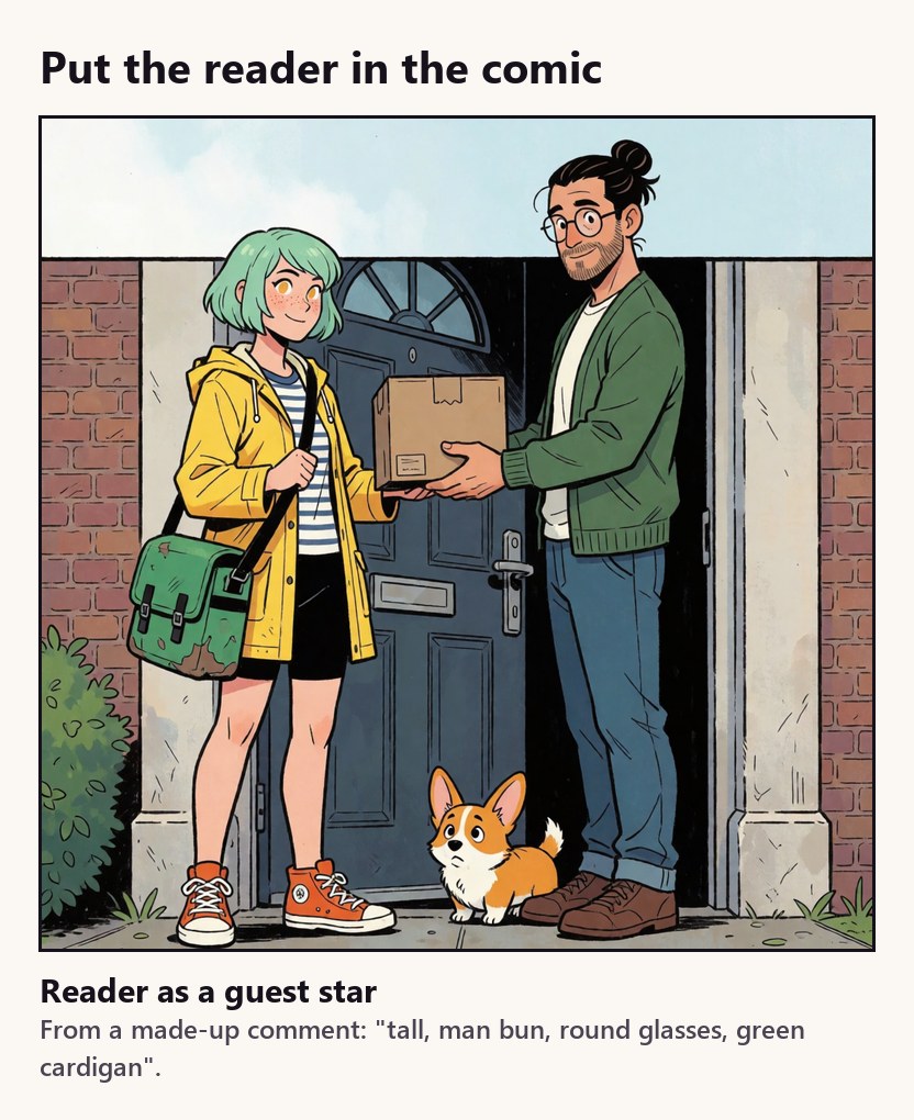
Anything that puts the reader inside the world works: drawing them, delivering them a parcel, letting them name the pet. It costs one extra image per person and it is the fastest way we know to turn a viewer into a regular.
The short version
- Write a six-line character card before any image.
- Lock the look in one sentence and paste it unchanged everywhere.
- Pick one style and keep it for the whole series.
- Four sentences first, four panels second. Give the payoff to the sidekick.
- One action per panel, one or two people, no borders.
- Leave the top of the panel empty and letter it yourself.
- Number the episodes, end on a question, and invite readers in.
Want to see it done every day?
Wren was made for this article, but the process is the one behind Mutuals Comics: a daily series with a running story for every character, free to read from the first panel to the latest cliffhanger. For more guides like this one, see the Mutuals blog.
Questions people ask
Can you make a comic with AI if you can't draw?
Yes. The drawing is the easy part now. What still takes skill is the writing, keeping a character looking like the same person from panel to panel, and choosing which images to keep. Start with one character card and one four-panel strip, and you will learn most of it in a weekend.
How do I keep my AI comic character consistent?
Write one description of the character, covering hair, eyes, build, outfit, shoes and accessories, and paste it unchanged into every panel. Give the character one or two features that are impossible to miss, like a hair colour or a pet, and compare every new panel against your best reference image, not against the last panel.
Which art style is best for AI comics?
Pick the style that fits the joke, then never switch mid-series. Heavy superhero inks suit drama and action, bright modern comic colouring stands out in a social feed, and flat webcomic art suits gags and soft moments. The same character description works in all three.
Should the AI write the speech bubbles?
No. Image models are still bad at text inside pictures. Ask for plain empty space at the top of the panel instead, and add the bubbles and lettering yourself afterwards. It looks cleaner and you can rewrite a joke without redrawing anything.
How long should an AI comic be?
Four panels is the sweet spot for social media: setup, build, turn, payoff. It fits in one swipe, forces you to cut everything that isn't the joke, and is short enough to post every day.
See it done every day
Mutuals Comics is a daily series made this way, and every character in it is someone you can actually chat with in the Mutuals app. Read Mutuals Comics or browse the blog.


Read next
- The best AI companion apps in 2026, and the one that texts you first
- The best Replika alternatives, starting with one that texts you first
- The best Character.AI alternatives, starting with characters who remember you
- How to make your own AI character, step by step
- What actually happens to the things you tell an AI companion